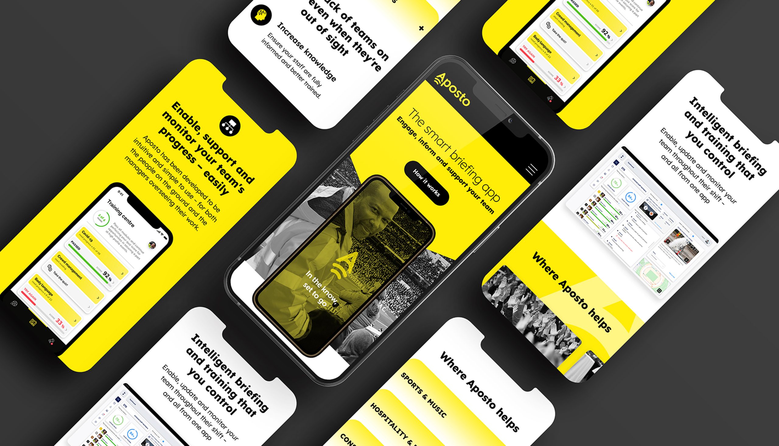
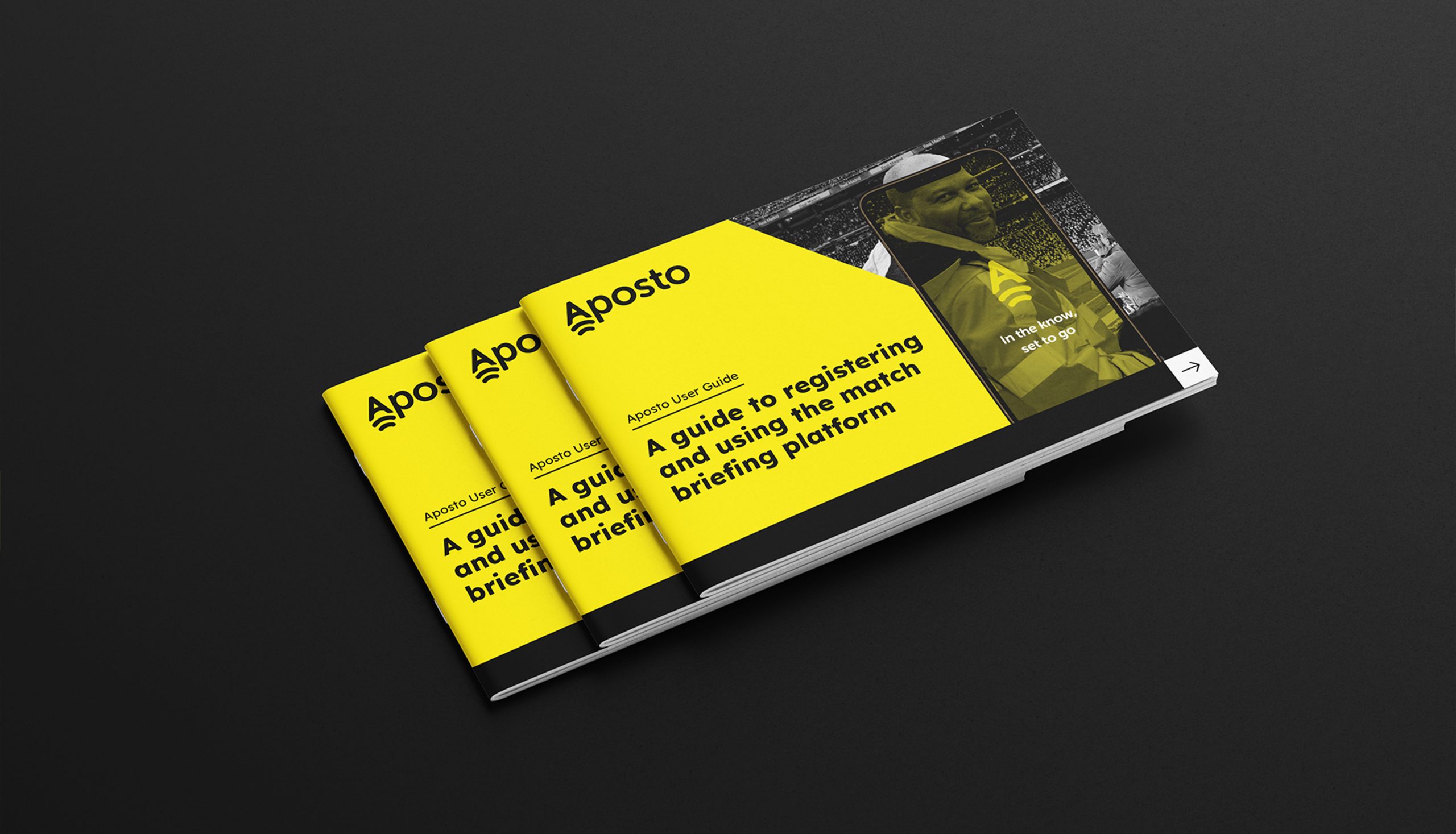
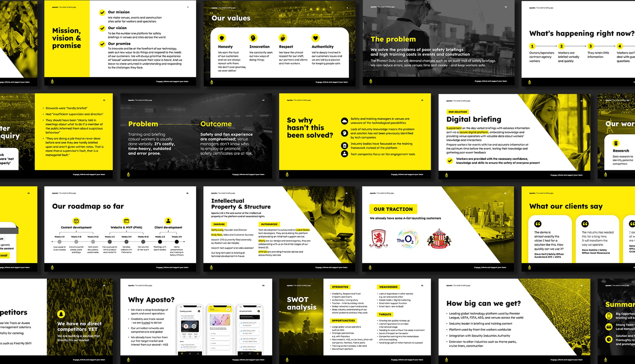
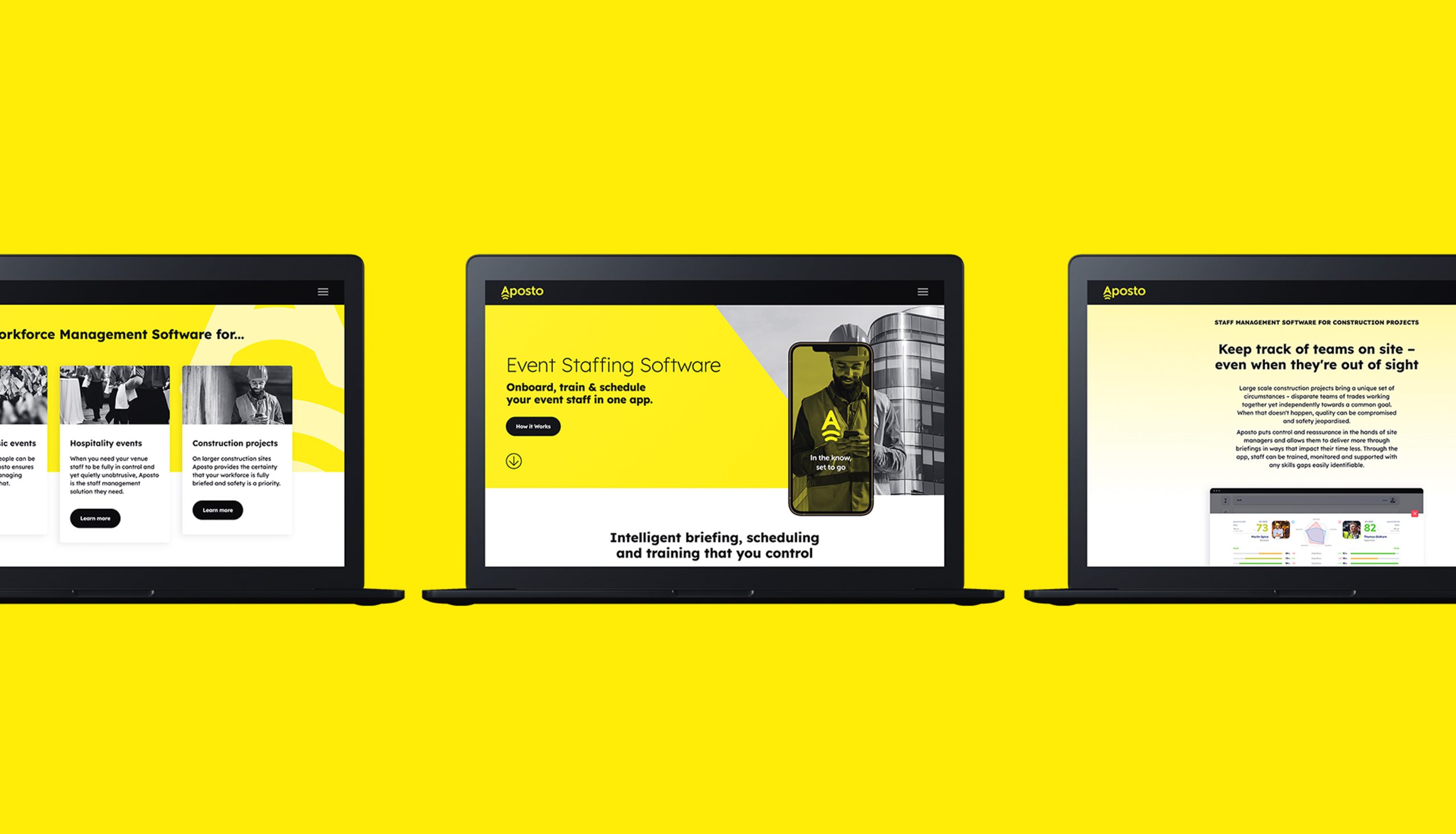
Aposto is an event staffing software that grew from the need of improving the briefing process for workers so that events, venues and construction sites can be safer for everyone involved. We were approached to develop Aposto’s brand and website for their product launch in the UK.
Strategy
We developed the brand look and feel, messaging, website and supporting collateral to reflect the opportunities that this exciting, new application can provide organisations. Based on the shape of the letter A, the brand identity is constructed to represent forward movement of a team that is unified and aligned. The brand’s eye-catching yellow colour connotes to the safety focus of this purpose-led business.