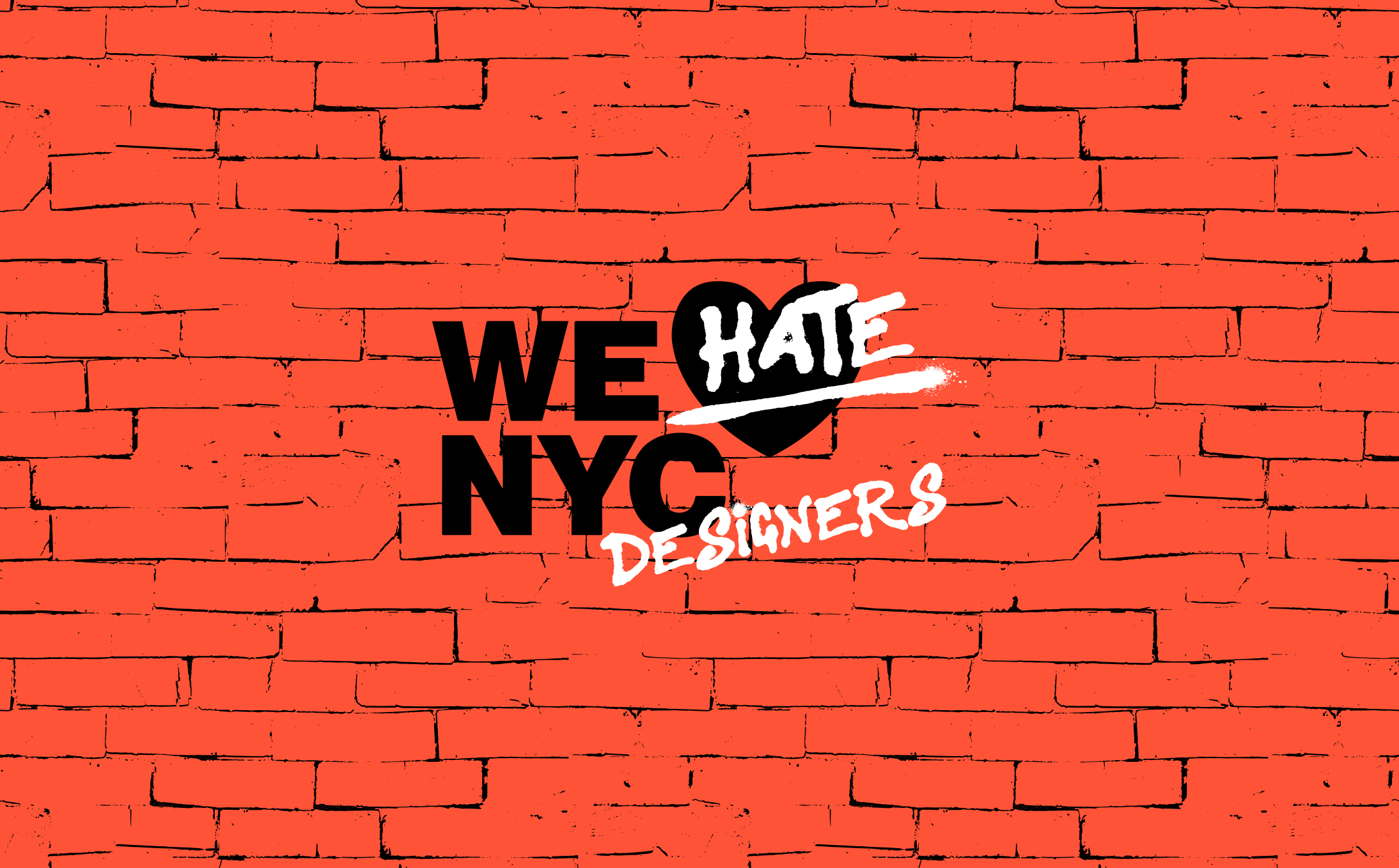
Taking the ❤ out of NY – and why its new logo is failing to find love
Now that the dust has settled a little following the launch of the new ‘WE  NYC’ logo, it’s time to take a slightly calmer and more considered look at why it’s got so many people hot under the collar.
Around 50 years since celebrated graphic designer Milton Glaser created the original “I NY” identity, the new one launched with a torrent of what can only be described as massive negativity.
Now, re-working an icon that famous was always going to a tricky gig but why did this particular attempt get up so many native New York noses?
I think to fully understand that you have to start with the original and get a handle on just why it worked so damn well.
Back in the 1970s old NYC wasn’t getting much love. It was seen as a bit of a basket case by the rest of the US and its reputation globally was as the home of street drug dealing, gangs, guns, corruption, depravity and poverty. It could most politely be described as dysfunctional. If you don’t know what I mean watch Martin Scorsese’s Mean Streets or Taxi Driver – that should do it.
Glaser’s creation was birthed to bring tourists to a city struggling economically. But what it also did (brilliantly and seemingly so effortlessly) was to capture the essence, attitude and spirit of the people of a city – as well as the boroughs, bridges and tunnels. This logo had instant NYC sass – it stuck a middle finger up at all the negativity and said ‘You don’t like our city? Well you’re wrong!’ It was singular, bold and as unapologetic as a New York cab driver. It made tourists think again and natives feel warm and fuzzy about their home. It was all things to all audiences.
And all of that is why it’s an impossible act to follow (or refresh).
The design itself was economically stark and like all the very best identities – didn’t seem to be making any effort to impress. It was just there. Big, bold and begging you to disagree – or at least ask why. But either way you just knew it wasn’t interested in your approval.
Typographically the American Typewriter font pitched it perfectly as the utilitarian, contrary declaration of pure love it was intended to be. This was a logo that read the room. It had an impeccable sense of timing and purpose. And it made those who felt it was talking for them – feel very special indeed. In pure design terms it was perfection.
Fast forward to today and officials recently unveiled the ‘new’ logo as part of a campaign to inspire civic engagement and volunteering in the city.
Let’s get the design out of the way first. It centres around a rather basic sans serif font (apparently adapted from the city’s subway signs) reading ‘WE NYC’. The positioning is a bit awkward and first time viewers might read it as ‘WE NYC ’. It’s not a unique or edgy layout. Just an unsatisfactory one.
The heart itself has been ‘modernised’ and given a little bit of a 3D Photoshop polish up, making it look very emoji-like in appearance but I’m guessing that’s the point. God, I hope that was the point! Overwhelming though, it’s the whole ‘tell me you’re designed-by-committee without telling me you’re designed-by-committee’ vibe that really jumps out from the screen.
And from there it’s all about why – why this approach? I get the idea behind the campaign but why revamp an existing, enduring logo that still stands very firmly on its own two feet? Why try to repurpose that for a whole new intention? New York is a very different place now to when Glaser did his thing and trying to shoehorn a new sentiment into his work frankly just smacks of a lack of new ideas.
New York is home to some of the best creative minds on the planet, yet this result does not represent that community at all well.
If the goal is to inspire civic engagement and volunteering, shouldn’t this be a completely different campaign or just something else entirely? A new message based on a new idea. A dynamic, inspiring call to action that skillfully brings the city together again under a clever visual identity. Not a collective rehash of an institution.
And why ‘we’ anyway? Who is ‘we’? Glaser’s version homed in on the ‘I’. It was all about me and my city – no one else. This was an ‘I’ that didn’t need anyone’s validation or an echo-chamber of agreement to declare their feelings for their home town. “This is a moment for we, not I” say the people who devised the campaign – oh please, enough already!
Other cities have tried similar concepts and have mostly cocked it up. Campaigns now have to work harder because today’s cities are more – much more. And they are notoriously hard to badge. NYC is not just about people thinking it’s one thing from the outside and its inhabitants valuing it as something more special from within. It’s way more layered than that. And I NY was about more than simply countering a misconception – it achieved so much more.
From a creative perspective the biggest issue I have with this new logo is that Glaser did all the heavy lifting – not once but twice!
He returned to the original design after the 9/11 attacks, and added to his baby – the 2001 heart was charred and the text now read: “I New York More Than Ever”. Again capturing the zeitgeist with minimal fuss. The design lead a campaign that with little media backing raised almost $200,000 for charities helping New Yorkers after the attacks.
Glaser did what this ‘new’ logo is attempting to do – and he did it 20 plus years ago.
Privately I’m sure those running the campaign would like another crack at this one but with something this high profile and the money they have spent on it – it’s doubtful the public would allow them the privilege.


Leave a Reply